 Blog.BusinessSigns.Net: Something about Business Signs.
The views of this article are for reference only. On January 14, 2019, we have some new view point. Because we realized that when we wrote this article, we are more about telling: "What is the best font for business signs production?"
As a signs manufacturer, we are not looking at fonts mostly, but the minimum stroke width, because this decide whether the design drawings have process feasibility.
When the business signs have the laser cutting process, the minimum stroke width should be the thickness of the material. For example, if you need laser cutting 1.5mm stainless steel commercial signs, then we need the minimum stroke width of the text to reach 1.5mm. And if your business signs needs to be illuminated, the consideration of the width of the stroke is more complicated, because we need to consider how to get uniform lighting for your signage, it's a big question, and there is no in-depth explanation here. After all, the topic we are talking about is the font.
For the laser cutting solid metal signs, the Min. width of the strokes need to reach the thickness of the material.
In fact, before the computer was widely used, the signs was used handwritten fonts or simple printed fonts mostly. After the computer became popular, the type of fonts showed an explosive growth, and we didn't know how to choose the font then. So let's talk about how to choose a font fit your business signage well simply.
In general, fonts are divided into serif fonts and sans-serif fonts. The commonly used Arial font is a very common sans-serif font, and Times New Roman is a very common serif font.
Sans-serif font:

Serif font:

Serif font(red serifs):

We suggest using sans-serif fonts for business signs,bolder font would be better, because:
- The stroke width of the sans-serif font is relatively uniform, which makes the production relatively simple whether it is a illuminated signs or the non-illuminated signs.
- Because the processing is relatively simple, it can also reduce the cost and time of production.
However, if your letters must use a serif font, please note that the minimum stroke width of the serif part is generally the minimum stroke width of the entire letter, which will have different requirements for different kind of business signs. For example, LED backlit signs, we need the Min. width of the serif part is more than 5mm, and the minimum stroke width of other parts except the serif part of the letter should reach 10mm, preferably more than 12mm, else would cause the lighting effect uneven.
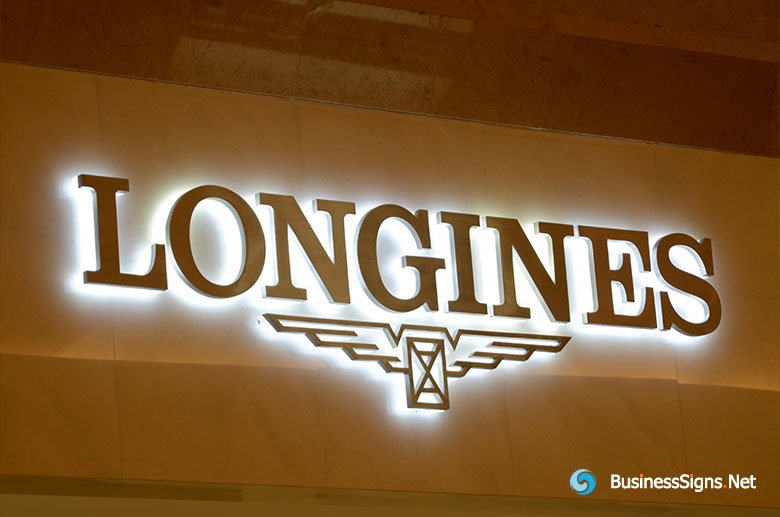
Please see the serif part of the "Longines", this kind of serif fonts fit for the business signs too.
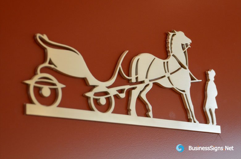
There is also a very special case, handwritten fonts or scripts fonts. This type of font often appears as a continuation, several letters are linked together. Please be careful to choose the font for your business signs. The connected fonts is the increased difficulty of production. The size of the raw material sheets we use is 244cm*122cm mostly. For conjoined words, it is normal to exceed 244cm. Then we needs to welded or spliced the raw material together, so it will have the weld seams or splicing marks, which will affect the effect of the signage. Then the large-sized commercial signs will cause transportation difficulties and installation difficulties. The biggest problem is that conjoined words can lead to less legibility of the content of the business signs. Unless it is a well-known trademark, such as Coca-Cola, although it is a conjoined letter, because it is already well-known, people may know from the curve outline that this is the logo of Coca-Cola. But it is difficult for people to see the contents of the conjoined letters from a distance mostly.
![]()
In fact, the font for Coca-Cola is not a good font for business signs, some strokes are too thin and some letter link together. But it is a very beautiful handwritten font. When the logo be produced as a LED illuminated signage, these thin strokes need to be bold.
In summary, for business signs, the sans-serif fonts would be a good choice. Serif fonts, handwritten fonts and scripts fonts can also be used for the business signs, but they need to be carefully considered. It is very important to make the design could be produced, otherwise everything will only stay on the drawing.
Pages
Archives
- January 2024
- December 2022
- January 2022
- January 2021
- March 2020
- December 2019
- June 2019
- February 2019
- January 2019
- December 2018
- December 2017
- August 2017
- December 2016
- November 2016
- October 2016
- June 2016
- December 2015
- November 2015
- October 2015
- March 2015
- January 2015
- December 2014
- March 2014
- July 2013
- July 2012
- May 2012
- March 2012
- December 2011
- November 2011
- April 2011
©Blog.BusinessSigns.Net All Rights Reserved.