 Blog.BusinessSigns.Net: Something about Business Signs.

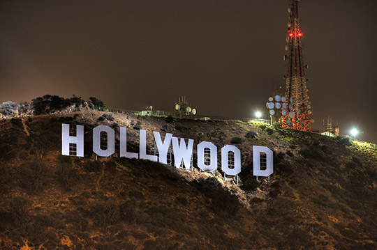
I think most people would know this title image, which is almost the most famous signage case in the world, you even can find it on wikipedia.org: https://en.wikipedia.org/wiki/Hollywood_Sign
Yes, this is the hollywood sign. This outdoor signage have a long history. It was originally created in 1923 as an advertisement for a local real-estate developer to identify his remote suburban subdivision, and originally read "HOLLYWOODLAND"
As a textbook examples of signage case, the hollywood sign can help you to know "How to increase the public's awareness of you by your business signs"
- 1: Content. Some signage including too much information, which would cause high cost also people would had to find the highlights in time.
- 2: Font. A clear font could help people to get the content of your signage quickly and correctly.
- 3: Size. A basic rule is that 3" letters are readable from 30 feet away and the Max. readable distance could be 100 feet. Then add one inch to the letter height for every 10 feet of distance they need to be read from. Obviously if you can fit a larger letter size, they will be easier to read. This is by no means an exact representation, there are many factors involved and this chart only represents the averages.
- 4: Color. The white Hollywood letters against a hillside of dark brown. The sharp contrast impress all the people.
- 5: Illuminated. The Hollywood letters is too big (45ft high) for individual illuminated signage, which need a lot of power and routine maintenance. The owner choose to use some big Spotlight to make the signage still could get a lot of attention in the night.

- 6: Location. The hollywood signage is not on the hilltop, the individual letters sit directly on the mountainside ground, so that all the individual letters could have the dark brown hillside backing. Also need not too worry about the wind to blown the signage.

- 7: Surrounding. On the hillside, there is no something important nearby, which would cause the signage could not get 100% attention.
Pages
Archives
- January 2024
- December 2022
- January 2022
- January 2021
- March 2020
- December 2019
- June 2019
- February 2019
- January 2019
- December 2018
- December 2017
- August 2017
- December 2016
- November 2016
- October 2016
- June 2016
- December 2015
- November 2015
- October 2015
- March 2015
- January 2015
- December 2014
- March 2014
- July 2013
- July 2012
- May 2012
- March 2012
- December 2011
- November 2011
- April 2011
©Blog.BusinessSigns.Net All Rights Reserved.

