 Blog.BusinessSigns.Net: Something about Business Signs.
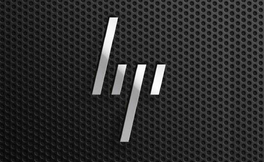
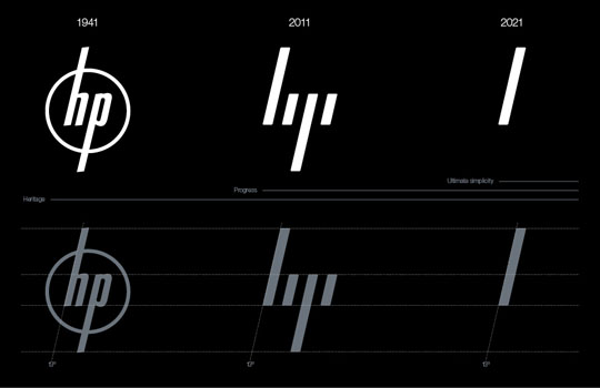
Moving brands have designed a new identity scheme for technology company HP (Hewlett Packard). The new logo sees the well established lower case 'hp' logo reduced to four forward slashes.

The defining signature of the system is the 13° angle. 13° represents HP’s spirit as a company, driven forward by ingenuity and optimism about the future and a belief in human progress. It also refers to the world of computing by recalling the forward slash used in programming. 13° exists within the brand identity, in the graphic language, product design and UI.
— Moving Brands

There is a lot of discussion right now about HP’s new logo, I think I need to say I like this logo, because we can build it in signage easily, hahahaha~~~.

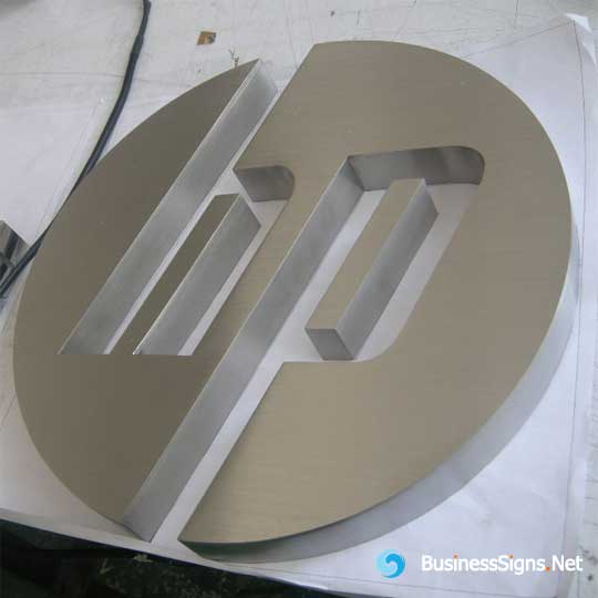
In fact we produce some brushed stainless steel fabricated business signs for some HP computer shop, so hope they would change the new logo soon, then we can get a lot of new orders, since they are very satisfied with our high quality signage product. Wow! Cool!
Pages
Archives
- January 2024
- December 2022
- January 2022
- January 2021
- March 2020
- December 2019
- June 2019
- February 2019
- January 2019
- December 2018
- December 2017
- August 2017
- December 2016
- November 2016
- October 2016
- June 2016
- December 2015
- November 2015
- October 2015
- March 2015
- January 2015
- December 2014
- March 2014
- July 2013
- July 2012
- May 2012
- March 2012
- December 2011
- November 2011
- April 2011
©Blog.BusinessSigns.Net All Rights Reserved.